All brands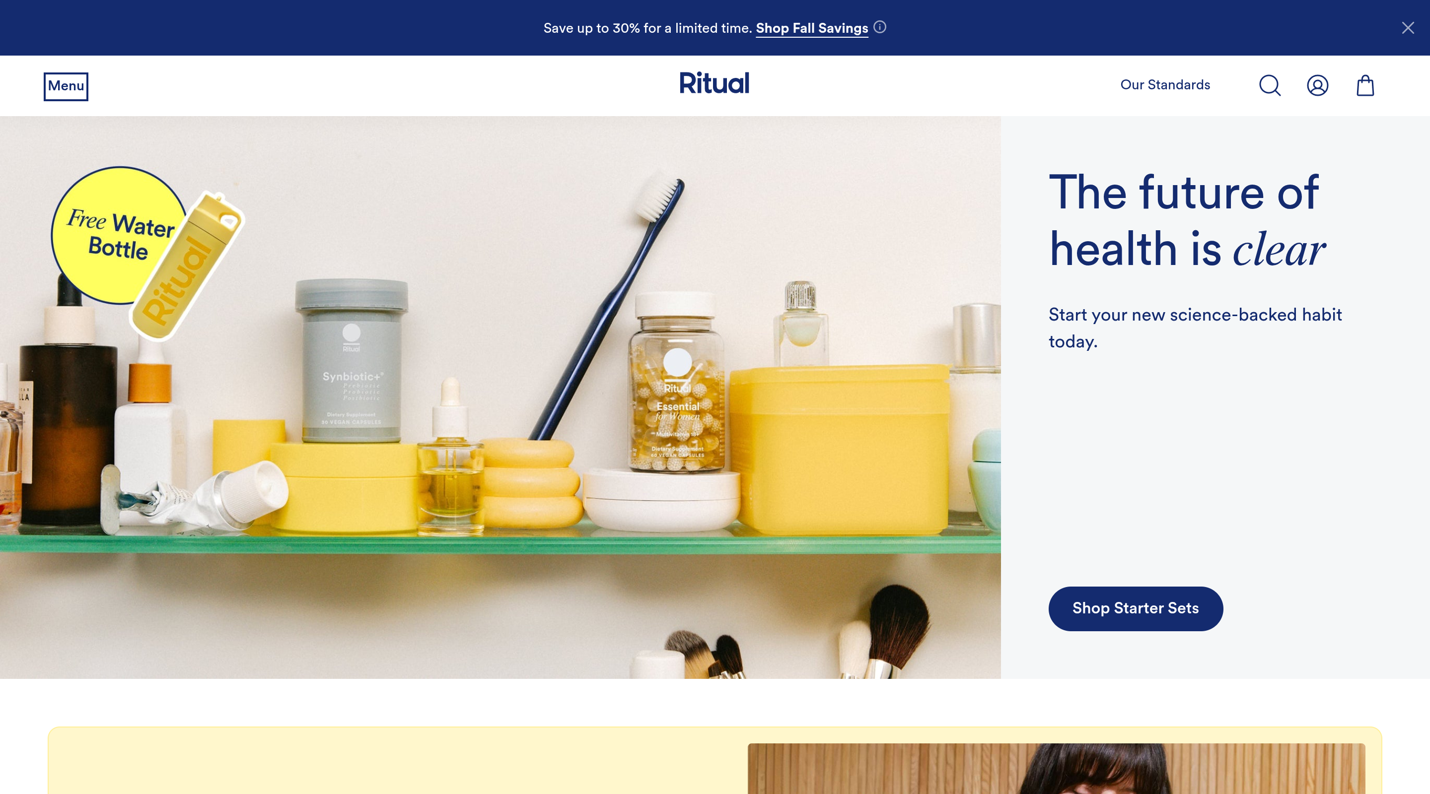
Ritual
Health & Wellness
905.3K/mo visits130active ads
Science-led supplement DTC built on radical transparency and a subscription-first model. Ritual sells trust, credibility, and the identity of a discerning, health-literate woman far more than the vitamins inside the bottle — its 'Made Traceable' promise turns ingredient sourcing into the entire brand story. Pricing is premium and anchored to recurring monthly delivery, so acquisition is engineered to convert straight into subscription rather than one-off carts. The funnel leans on clinical proof, ingredient traceability, and the instantly recognizable clear capsule with its floating oil bead to justify the price and drive retention. Radical ingredient traceability builds category-leading trust and authority Subscription-first model locks in predictable recurring revenue and high LTV Iconic clear capsule with a floating oil bead makes the product unmistakable Clinical, scientific framing justifies premium pricing over drugstore vitamins
Brand DNA
TypefaceCircularXXclean geometric sans, serif-italic warmth
Ritual's homepage is clinical-calm minimalism anchored by a single deep indigo-navy (#202548) that carries the wordmark, nav, every headline, and the CTA against near-white and pale-grey ground. The hero splits a sunlit product video — Ritual bottles throwing hard diagonal shadows across green turf, gold capsules glowing inside — against a soft grey panel where 'Cool Science' sits above an italic Dutch801 serif 'Hotter Savings,' with 'Save up to 30% when you bundle traceable essentials' and a solid navy pill 'Shop the Sale' owning all the contrast on the page. Conversion scaffolding stays understated but deliberate: a 'Shop Sale Bestsellers' rail merchandises products on buttery yellow (#FBF0AF) backdrops with white 'Best Seller' pills and a navy circular 'FREE GIFT' badge, while a review block runs five gold stars over a navy testimonial that italicizes the payoff word ('tasted delicious') for warmth. The footer sells the brand's values — a 'We have high standards for emails too' email capture, plus B-Corp and BBB trust marks and an FDA disclaimer that quietly reinforce credibility.
Steal this: the split sunlit-video-vs-sale-panel hero with one high-contrast navy CTA, plus the single italic-serif accent word dropped into an otherwise geometric-sans system to signal warmth without breaking the clinical minimalism.