All brands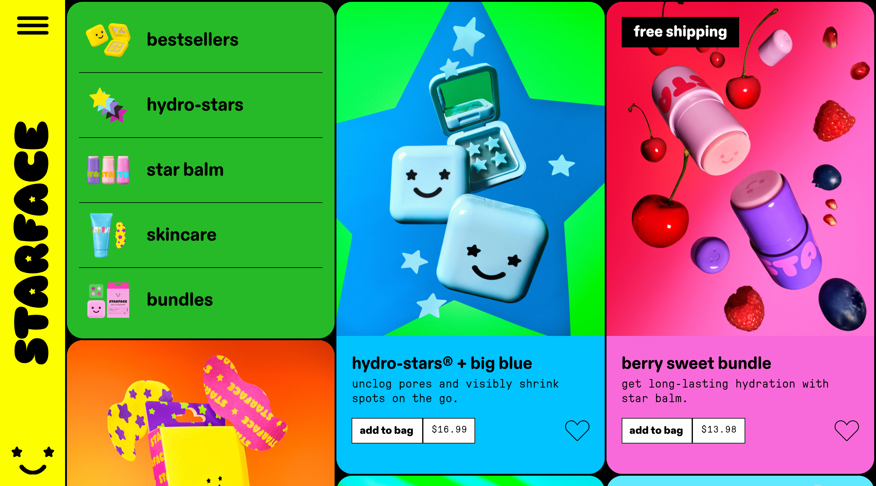
Starface
Beauty & Personal Care
186.5K/mo visits200active ads
Gen-Z self-care DTC that turned acne into a personality flex. Starface sells identity, playfulness, and permission to feel cute about a breakout far more than clinical skincare performance, with its star-shaped hydrocolloid patches functioning as stickers you actually wear out. Pricing is deliberately accessible-impulse (core patches at $12.99), lowering the barrier to first purchase and gifting. Retention leans on rewards, subscribe & save, and bundles rather than heavy discounting, keeping the brand feeling like a club instead of a pharmacy. Star-shaped patches make a functional product feel like self-expression and collectible fashion Accessible $12.99 pricing drives impulse conversion and easy gifting Maximalist color-blocked branding is instantly recognizable and hyper creator-friendly Rewards, subscribe & save, and bundles build LTV without eroding the playful premium
Brand DNA
DisplayABC Diatype Rounded HeavyBodyGT Pressura Mono Textrounded heavy sans, mono body clash
Starface's homepage is a maximalist color-blocked bento grid where every product literally owns a saturated tile — a lime-green category card (bestsellers, hydro-stars, star balm, skincare, bundles, each with a tiny product thumbnail and hairline dividers), a pale-cyan 'new' hero tile floating the hydro-star pack among blue polka dots and star patches, and a hot-magenta-to-purple 'black star' tile — all framed by a highlighter-yellow left rail carrying the STARFACE logotype set vertically in a chunky bubble display. A black announcement bar runs the launch message ('new! hydro-star microdarts... target + shrink early-stage spots with salicylic acid'), and each product tile closes with a split 'add to bag / $12.99' control where a plain white button and an inline boxed price sit side by side against the loud background. Type is a deliberate clash: ABC Diatype Rounded Heavy for product names and nav versus GT Pressura Mono for descriptions, giving copy a zine-like typewriter texture. A separate blue tile flashes a black 'free shipping' badge over candy-bright gummy and fruit imagery, and the footer opens with a 'treat me like a star' email capture plus subscribe & save and rewards links; no strikethrough, subscribe-anchor, or review counts are shown in these views.
Steal this: the color-blocked bento where each SKU owns its own saturated tile, plus the split 'add to bag / price' button that keeps the price legible right inside the CTA row.
Pages3
Ads6
welcome back @2girls1bottl3 ⭐ the star balm hydration station 🥤 here have a sip ♥
FacebookStarface
Running for 2 mo · 6 variants
keep your lips super soft with the most cushiony lip balm ☁️ find this sweet and dreamy flavor + more star balms now!
FacebookStarface
Running for 5 mo · 2 variants
get invisible coverage for unexpected breakouts with hydro-star clear 🫧 your go-to hydrocolloid patch in 2 sizes!
FacebookStarface
Running for 4 mo · 6 variants
Read reviews and buy Starface Hydro-Star Play Pack Pimple Patches - 32ct: Vegan, Face Application, Unscented at Target. Choose from contactless Same Day Delivery, Drive Up and more.
FacebookStarface
Running for 3 mo · 3 variants